Dear Moderator,
This is my A2 Media Blog where i kept record of my progress throughout the year, i hope you enjoy your visit as much as i enjoyed putting it together throughout the year.
Kind Regards,
Neil.

Wednesday 18 May 2011
Final Ancillary Products


I wanted to stick to three main colours; Black, White and The brownish colour.
I tried to keep it simple, with just one picture on each slide (except front cover) because i believe the simplicity is affective and works well.
I Kept the same font style all the way through (Hobo) reason for the font is that the artist is a kid (Teenager) and i believe the font appeals to the age of the artist.
I did come across trouble when finding a disc tray to put in, so in the end i attempted to make on and i inserted that instead. (google was no help, nor was the downloaded templates)
Overall i am pleased with my Ancillary Products.
Evaluation Question 1.
Evaluation 1. In what ways does your media product use, develop or challenge forms and conventions of real media products?
(before reading i would like to add i had a issue with TubeChop, most of the time it works, sometimes i didnt play, you may need to refresh.)
Camera angle element.
In this TubeChop i show the camera angle i was looking for in my final product, a disoriented look, but staying concentrated on the main character in the shot. I believe the disoriented look went well with the lyrics and the original music video of the artist Kid Cudi, shown below.
I believe i managed to pull off the disorient look in my final product.
In fact my music video got comments from classmates asking if i did it with green screen, how i kept the camera still the whole time and the background moving. I copied the camera angle throughout the bloc party video onto my music video, however they would have used professional equipment to keep the camera steady whereas I used a tripod and made each person hold it. I wanted to keep this element throughout to keep a linear continuity to the music video.
Clothing & Representation of my Character.
As the lyrics of the song is in the genre of hip-hop i wanted to incorporate the clothing style and representation of hip-hop into my cast, however Kid Cudi's style is Urban hip-hop clothes such as hoodies and jeans, and seeing as you only see above the shoulders in my music video it was hard to try incorporate clothing into the music video.
Above is what i believe Kid Cudi's style is and below is how i have linked from kid cudi's style into my characters.


Ancillary Products.
When it came to my digipak i researched and analysed a few current digipaks available already. Evidence of this shown below.


 I then picked from the three analysed albums which i liked the most and would fit my artist and genre or music, in result i chose to favour Example's cover 'Won't Go Quietly', i really liked the multiple pictures window pane look and wanted to use this element on my album cover. I believe my album cover challenges Examples convention of that.


(before reading i would like to add i had a issue with TubeChop, most of the time it works, sometimes i didnt play, you may need to refresh.)
Camera angle element.
In this TubeChop i show the camera angle i was looking for in my final product, a disoriented look, but staying concentrated on the main character in the shot. I believe the disoriented look went well with the lyrics and the original music video of the artist Kid Cudi, shown below.
I believe i managed to pull off the disorient look in my final product.
In fact my music video got comments from classmates asking if i did it with green screen, how i kept the camera still the whole time and the background moving. I copied the camera angle throughout the bloc party video onto my music video, however they would have used professional equipment to keep the camera steady whereas I used a tripod and made each person hold it. I wanted to keep this element throughout to keep a linear continuity to the music video.
Clothing & Representation of my Character.
As the lyrics of the song is in the genre of hip-hop i wanted to incorporate the clothing style and representation of hip-hop into my cast, however Kid Cudi's style is Urban hip-hop clothes such as hoodies and jeans, and seeing as you only see above the shoulders in my music video it was hard to try incorporate clothing into the music video.
Above is what i believe Kid Cudi's style is and below is how i have linked from kid cudi's style into my characters.
For myself (above) i went for the urban/indie look that Kid Cudi wears with a chequered shirt.
For Chris (above) i went for the leather that Kid Cudi wears with a grungy urban top underneath to link with the urban wear that Kid Cudi wears.
As Lotte (above) & Hannah (below) are both female it was hard to think how they could dress representing hip hop and urban clothing styles. Lotte went with a blue puff body warmer, which has became very popular in fashion, it would be wrong to say that only hip-hop/urban styles wear them because they have became mainstream again.
For Hannah, i tried to go with a chequered style again that Kid Cudi wears.
With George (above) i asked him to wear a polo shirt inside a plain hoodie preferably dark, luckily he had a black hoodie with white roped tassels around the hood, this links well with the type of hoodie Kid Cudi wears mostly. Similar to the attached image.
Ancillary Products.
When it came to my digipak i researched and analysed a few current digipaks available already. Evidence of this shown below.

I chose the above albums to research because they are personal favourites of mine. In addition i believe that its good to have good knowledge of Kid Cudi's previous albums and albums of the same genre.
I then went on to analyse three of the above albums. They are shown below.


Below, to the left is my album cover, and to the right is Example's professionally made album cover.

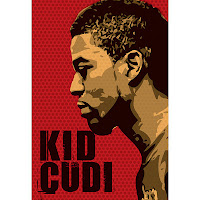
When it came to looking at a poster for my digipak i research Kid Cudi posters and other hip-hop posters.
And from those three above that i liked, i decided i only wanted to take some elements from them; such as, how its only the artist in the poster and the name of the artist, so i decided i wanted those elements in my poster. In addition i also liked the simplicity of the posters, not a huge variety of colours and simple text. I believe that simplicity works better and stands out more, plus i think it works with the music video and digipak well.
Evaluation Question 2
Evaluation 2. How effective is the combination of your main product and ancillary texts?

Click Image to Enlarge

This video links with the change of faces, noted in the bottom right of the image above.
Evaluation Question 3
3. What have you learned from your Audience feedback?


I thought about doing stop motion to start my music video. However i gave myself some thought and received some feedback on the idea and decided not to, i didn't think it fitted with the action within the music video. I also asked my family and friends whether i should include it or not and they agreed that it wouldn't go well. The friends feedback was reliable because they are at the ages between my target audience.

From receiving constructive feedback i chose to change the whole concept of my first music video idea. Reason for this is that the action and narrative storyline was not going along with the music and not working.

From my numberous amount of feedback i have recieved a variety of positives and negatives.


Click Images to Enlarge
My Audience profile

Some screen grabs as evidence of feedback.
Draft Video Feedback.


I thought about doing stop motion to start my music video. However i gave myself some thought and received some feedback on the idea and decided not to, i didn't think it fitted with the action within the music video. I also asked my family and friends whether i should include it or not and they agreed that it wouldn't go well. The friends feedback was reliable because they are at the ages between my target audience.

From receiving constructive feedback i chose to change the whole concept of my first music video idea. Reason for this is that the action and narrative storyline was not going along with the music and not working.

From my numberous amount of feedback i have recieved a variety of positives and negatives.

Even though i did and do not expect views from Germany i thought i would show that some viewers were restricted access to my music video.

Above is the comments i got on my video on youtube. I believe the viewer who comments "You deserve more views" is saying that the video is good. I also got three thumbs up which is better than zero thumbs up. So from the little feedback i got via YouTube, i believe it is positive feedback.

The Image above is my statistics on YouTube of my music video views.
From that image we can see that the video was most popular within the UK, USA and Canada, which is understandable as the lyrics are english. In addition, from the image we can see that Male viewers aged 13-17 viewed the video, which is close to my target market, just shy of three more years.
Subscribe to:
Posts (Atom)